Components
In this section you can learn how to install and implement the graphic components of the defactor library in your solutions.
UI Storybook
Check out our collection of react components for defactor user interfaces here: https://ui-kit.defactor.dev
Components API
In this section, you can see the API of each component
Button Component

Props
Props of the Button component are also available
| Name | Type | Default value | Description |
|---|---|---|---|
| variant | string | - | The variant of the button with 3 values: contained, outlined and text. (Required) |
| bgColor | string | - | The background color of the button. (Optional) |
| label | string | - | The label of the button. (Optional) |
| color | string | - | The color label of the button. (Optional) |
| disabled | boolean | false | If true, the component is disabled. (Optional) |
| fontFamily | string | - | The font family of the button. (Optional) |
| fullWidth | boolean | - | If true, the input will take up the full width of its container. (Optional) |
| borderColor | string | - | The color border of the button. (Optional) |
| externalStyles | string | - | The external custom styles of button. (Optional) |
| loader | React Element or string | - | The loader of the button. (Optional) |
| icon | React Element or string | - | The icon of the button. (Optional) |
You can interact with the component in the following link Button
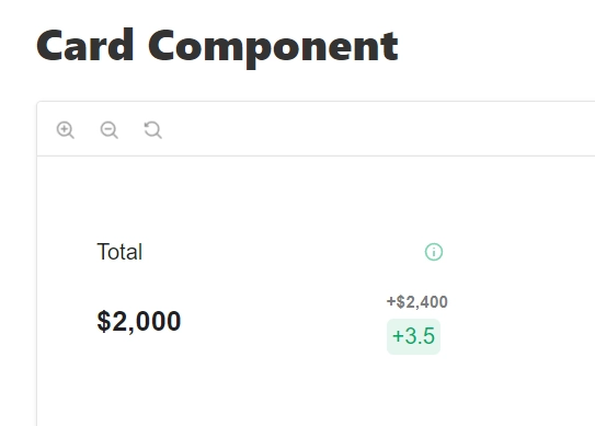
Card Component
Props
Props of the Card component are also available
| Name | Type | Default value | Description |
|---|---|---|---|
| label | string | - | The label of the card. (Required) |
| value | string or number | - | The value of the card. (Required) |
| fluctuation | string | - | The fluctuation of the card. (Optional) |
| fluctuationValue | string | - | The fluctuationValue of the card. (Optional) |
| hoverBehavior | boolean | false | If true, the tooltip will work on hover in all the card. (Optional) |
| color | string | - | The color of the point in the card. (Optional) |
| fontFamily | string | - | The font family of the card. (Optional) |
| externalStyles | string | - | The external custom styles of card. (Optional) |
| infoTooltip | ITooltip | - | The information of the tooltip in the card. (Optional) |
You can interact with the component in the following link Card Component
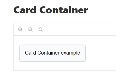
Card Container
Props
Props of the Card Container are also available
| Name | Type | Default value | Description |
|---|---|---|---|
| content | React Node | - | The content of the card. (Required) |
| handleMouseEnter | ((newValue: boolean) => void) | - | The function to run on mouse enter of the card. (Optional) |
| handleMouseLeave | ((newValue: boolean) => void) | - | The function to run on mouse leave of the card. (Optional) |
| isPointer | boolean | - | If true, the mouse is displayed as a pointer. (Optional) |
| hoverBehavior | boolean | false | If true, the tooltip will work on hover in all the card. (Optional) |
You can interact with the component in the following link Card Container
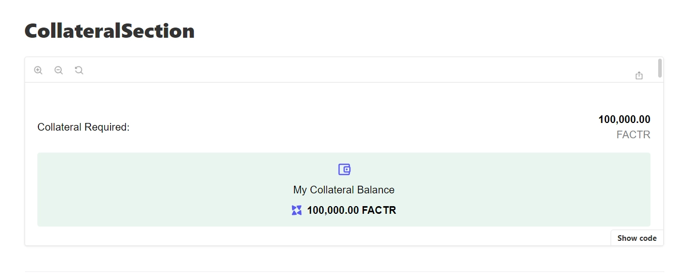
Collateral Section
Props
Props of the Collateral Section are also available
| Name | Type | Default value | Description |
|---|---|---|---|
| textCollateral | string | - | The text collateral of the collateral section. (Optional) |
| numberCollateral | string | - | The number collateral of the collateral section. (Optional) |
| textWallet | string | - | The text collateral of the collateral section. (Optional) |
| numberWallet | string | - | The number collateral of the collateral section. (Optional) |
| requiredSection | boolean | - | If true, is displayed the collateral required of the collateral section. (Required) |
| tokenSymbol | string | - | The token symbol displayed in the collateral section. (Optional) |
| walletIcon | React Element or string | - | The wallet icon in the collateral section. (Optional) |
| fontFamily | string | - | The font family of the collateral section. (Optional) |
| backgroundColor | string | #26A66B1A | The background color of the collateral section. (Optional) |
| loader | React Element or string | - | The loader of the collateral section. (Optional) |
| tokenIcon | React Element or string | - | The token icon of the collateral section. (Optional) |
You can interact with the component in the following link Collateral Section
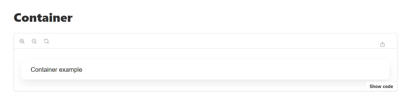
Container
Props
Props of the Container are also available
| Name | Type | Default value | Description |
|---|---|---|---|
| content | React Node | - | The content of the container. (Required) |
| externalStyles | string | - | The external custom styles of container. (Optional) |
You can interact with the component in the following link Container
Dashboard
Props
Props of the Dashboard are also available
| Name | Type | Default value | Description |
|---|---|---|---|
| colors | string[] | - | The colors to represent the data. (Optional) |
| currency | string | - | The currency to display in the dashboard. (Required) |
| currencyIcon | React Element or string | - | The currency icon to display in the dashboard. (Optional) |
| totalValueLocked | number or string | - | The total value locked to display in the dashboard. (Required) |
| titleGraphic | string | - | The title to display in the dashboard. (Required) |
| bottomLabel | string | - | The bottom label to display in the dashboard. (Required) |
| bottomIcon | React Element or string | - | The bottom icon to display in the dashboard. (Optional) |
| bottomContainerItems | CardItem[] | [] | The bottom information cards to display in the dashboard. (Optional) |
| rightLabel | string | - | The right label to display in the dashboard. (Required) |
| rightIcon | React Element or string | - | The right icon to display in the dashboard. (Optional) |
| rightContainerItems | CardItem[] | [] | The right information cards to display in the dashboard. (Optional) |
| fontFamily | string | - | The font family of the dashboard. (Optional) |
| content | React Node | - | The content of the dashboard. (Required) |
You can interact with the component in the following link Dashboard
Drop Down
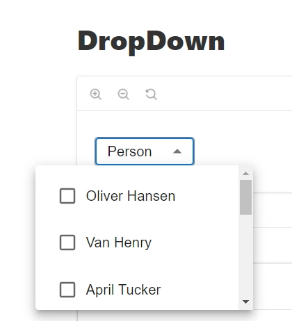
Props
Props of the DropDown are also available
| Name | Type | Default value | Description |
|---|---|---|---|
| placeholder | string | - | The placeholder in the dropdown. (Required) |
| options | string[] | - | The options to display in the dropdown. (Required) |
| fontFamily | string | - | The font family of the dropdown. (Optional) |
| onChange | (() => void) | - | The function to run by change of the dropdown. (Required) |
You can interact with the component in the following link DropDown
Flat Container
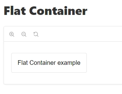
Props
Props of the Flat Container are also available
| Name | Type | Default value | Description |
|---|---|---|---|
| content | React Node | - | The content of the flat container. (Required) |
| externalStyles | string | - | The external custom styles of the flat container. (Optional) |
You can interact with the component in the following link Flat Container
Informative Container
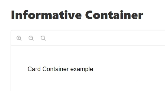
Props
Props of the Informative Container are also available
| Name | Type | Default value | Description |
|---|---|---|---|
| externalStyles | string | - | The external custom styles of the informative container. (Optional) |
| content | React Node | - | The content of the informative container. (Required) |
| handleMouseEnter | ((newValue: boolean) => void) | - | The function to run on mouse enter of the informative container. (Optional) |
| handleMouseLeave | ((newValue: boolean) => void) | - | The function to run on mouse leave of the informative container. (Optional) |
| isPointer | boolean | - | If true, the mouse is displayed as a pointer. (Optional) |
| hoverBehavior | boolean | false | If true, the tooltip will work on hover in all the informative container. (Optional) |
You can interact with the component in the following link Informative Container
Input

Props
Props of the Input are also available
| Name | Type | Default value | Description |
|---|---|---|---|
| value | InputValue | - | The value of the input. (Required) |
| setFormat | boolean | - | If true, set format of the input. (Optional) |
| type | HTMLInputTypeAttribute | - | The type of value of the input. (Optional) |
| onChange | (e: ChangeEvent<HTMLInputElement>) => void | - | The function to run on change of the input. (Required) |
You can interact with the component in the following link Input
Language Selector
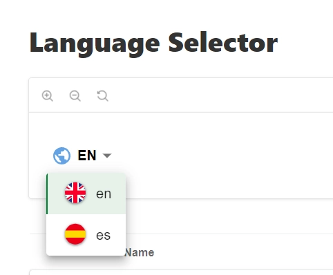
Props
Props of the Language Selector are also available
| Name | Type | Default value | Description |
|---|---|---|---|
| locale | string | - | The current language. (Required) |
| pathname | any | - | The pathname to update language page. (Required) |
| router | any | - | The router to update language page. (Required) |
| t | any | - | The function to get translation page. (Required) |
| options | OptionLanguage[] | - | The options language. (Required) |
| icon | React Element or string | - | The icon language selector button. (Optional) |
| activeIcon | React Element or string | - | The active icon language selector on hover button. (Optional) |
| bgColor | string | #057d2f | The background color of language selector options. (Optional) |
You can interact with the component in the following link Language Selector
LendBorrow
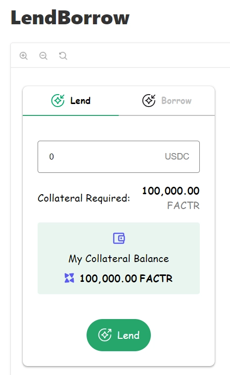
Props
Props of the LendBorrow are also available
| Name | Type | Default value | Description |
|---|---|---|---|
| color | string | #26a66b | The color of button and tab selected. (Optional) |
| onLend | () => void | - | The function to run on lend of LendBorrow . (Required) |
| onBorrow | () => void | - | The function to run on borrow of LendBorrow . (Required) |
| bgColor | string | - | The background color of collateral section. (Optional) |
| walletSvg | string | - | The wallet icon of collateral section. (Required) |
| labelLend | string | - | The label of lend tab. (Required) |
| currentTab | string | - | The label of current tab. (Required) |
| disabled | boolean | - | If true, the component is disabled. (Optional) |
| lendingSvg | string | - | The lending icon of lend borrow. (Required) |
| labelBorrow | string | - | The label of borrow tab. (Required) |
| textWallet | string | - | The text wallet of collateral section. (Optional) |
| fontFamily | string | - | The font family of the lend borrow. (Optional) |
| tokenSymbol | string | - | The token symbol displayed in the collateral section. (Optional) |
| borrowingSvg | string | - | The borrowing icon of borrow borrow. (Required) |
| textCollateral | string | - | The text collateral of collateral section. (Optional) |
| value | bigInt or InputValue | - | The value of lend borrow. (Required) |
| collateralBalance | string | - | The collateral balance of lend borrow. (Optional) |
| loader | React Element or string | - | The loader of lend borrow. (Optional) |
| collateralRequired | string | - | The amount collateral required of the collateral section. (Optional) |
| showRequiredCollateral | boolean | false | If true, display of the amount collateral required of the collateral section. (Optional) |
| loaderCollateral | React Element or string | - | The loader of collateral section. (Optional) |
| tokenIcon | React Element or string | - | The token icon of the collateral section. (Optional) |
| onChange | () => void | - | The function to run on change of the input. (Required) |
| onChangeTab | () => void | - | The function to run on change of tab. (Required) |
You can interact with the component in the following link LendBorrow
Modal

Props
Props of the Modal are also available
| Name | Type | Default value | Description |
|---|---|---|---|
| content | React Node | - | The content of the modal. (Required) |
| close | () => void | - | The function to run on close of the modal. (Required) |
| isOpen | boolean | - | If true, open the modal. (Required) |
| externalStyles | string | - | The external custom styles of the modal. (Required) |
You can interact with the component in the following link Modal
Pill

Props
Props of the Pill are also available
| Name | Type | Default value | Description |
|---|---|---|---|
| label | React Element or string | - | The label of the pill. (Required) |
| customBorder | string | - | The custom style of the border of the pill. (Optional) |
| color | string | - | The color label of the pill. (Required) |
| bgColor | string | - | The background color of the pill. (Required) |
| fontFamily | string | - | The font family of the pill. (Optional) |
| externalStyles | string | - | The external custom styles of the pill. (Optional) |
You can interact with the component in the following link Pill
Preview Profile

Props
Props of the Preview Profile are also available
| Name | Type | Default value | Description |
|---|---|---|---|
| label | string | - | The label of the preview profile. (Optional) |
| image | string | - | The image of the preview profile. (Optional) |
| bgColor | string | - | The background color of the preview profile. (Optional) |
| fontSize | string | - | The font size of the preview profile. (Optional) |
| imageSize | string | - | The image size of the preview profile. (Optional) |
| fontWeight | string | - | The font weight of the preview profile. (Optional) |
| fontFamily | string | - | The font family of the preview profile. (Optional) |
| imgChild | React Element or string | - | The image child of the preview profile. (Optional) |
You can interact with the component in the following link Preview Profile
SideBar

Props
Props of the SideBar are also available
| Name | Type | Default value | Description |
|---|---|---|---|
| menuOptions | React Node | - | The content options of the sideBar. (Required) |
| externalStyles | string | - | The external custom styles of the sideBar. (Optional) |
You can interact with the component in the following link SideBar
Small Profile

Props
Props of the Small Profile are also available
| Name | Type | Default value | Description |
|---|---|---|---|
| image | string | - | The image of the small profile. (Optional) |
| icon | string | - | The icon of the small profile. (Optional) |
| size | string | - | The size of the small profile. (Optional) |
| bgColor | string | #F8F9FC | The background color of the small profile. (Optional) |
| imgChild | React Element or string | - | The image child of the small profile. (Optional) |
You can interact with the component in the following link Small Profile
Table
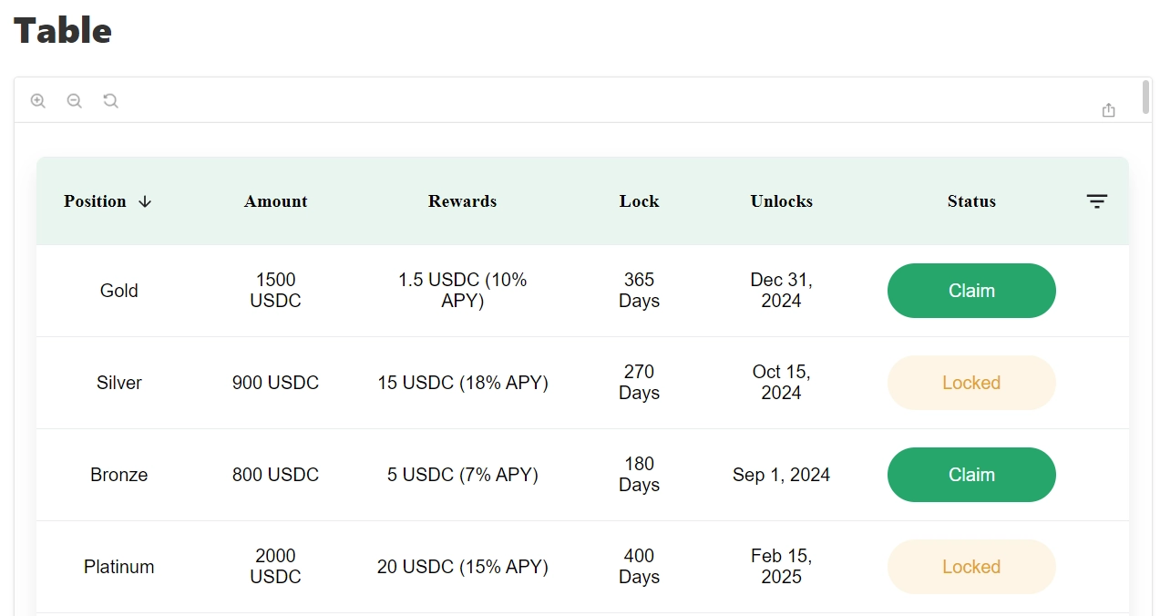
Props
Props of the Table are also available
| Name | Type | Default value | Description |
|---|---|---|---|
| rows | IRowsObject[] | - | The rows of the table. (Required) |
| loading | boolean | - | If true, display the loading state of the table. (Optional) |
| fontFamily | string | - | The font family of the table. (Optional) |
| emptyTitle | string | - | The title to display if don't have data of the table. (Optional) |
| emptyDescription | string | - | The description to display if don't have data of the table. (Required) |
| emptyIcon | React Node | - | The icon to display if don't have data of table. (Optional) |
| visiblePage | number | - | The selected page of the table. (Optional) |
| haveOptions | boolean | - | If true, allow display options button of the table. (Optional) |
| headerbgColor | string | - | The background color on the header of the table. (Optional) |
| rowsHoverColor | string | rgba(38, 166, 107, 0.1) | |
| The background color on the rows on hover mouse of the table. (Optional) | |||
| totalRowsNumber | number | - | The rows number of the table. (Required) |
| rowsNumberLabel | string | - | The label of rows number by page of the table. (Optional) |
| rowsPage | number[] | - | The options of rows number by page of the table. (Optional) |
| rowsPageSelected | number | - | The current rows number by page of the table. (Required) |
| headers | IHeaderObject[] | - | The headers columns of the table. (Required) |
| filters | IFilterObject[] | - | The filter by column of the table. (Optional) |
| nextPage | (motion: string) => void | - | The function on click next page button of the table. (Optional) |
| loaderComponent | React Node | - | The loader component of the table. (Optional) |
| handleSelectedPage | (selectedValue: number) => void | - | The function to run on select page of the table. (Optional) |
| setFilters | ()=> void | - | The function to set the filters of the table. (Required) |
| handleSelectedRowsPage | (selectedValue: string) => void | - | The function to run on select number rows of the table. (Required) |
You can interact with the component in the following link Table
Tooltip

Props
Props of the Tooltip are also available
| Name | Type | Default value | Description |
|---|---|---|---|
| text | string | - | The text of the tooltip. (Required) |
| fontFamily | string | - | The font family of the tooltip. (Optional) |
| icon | React Element or string | - | The icon of the tooltip. (Optional) |
| activeIcon | React Element or string | - | The active icon of the tooltip on hover. (Optional) |
| sizeIcon | number | - | The size icon of the tooltip . (Optional) |
| bgColor | string | #26a66b | The background color of the tooltip. (Optional) |
| color | string | - | The color label of the tooltip. (Optional) |
| open | boolean | false | The state of the tooltip. (Optional) |
| position | string | - | The position of the tooltip with 4 values: top, left, right, bottom. (Optional) |
| handleChange | (newValue: boolean) => void | - | The function to run on change of the tooltip. (Required) |
You can interact with the component in the following link Tooltip
Bar Chart
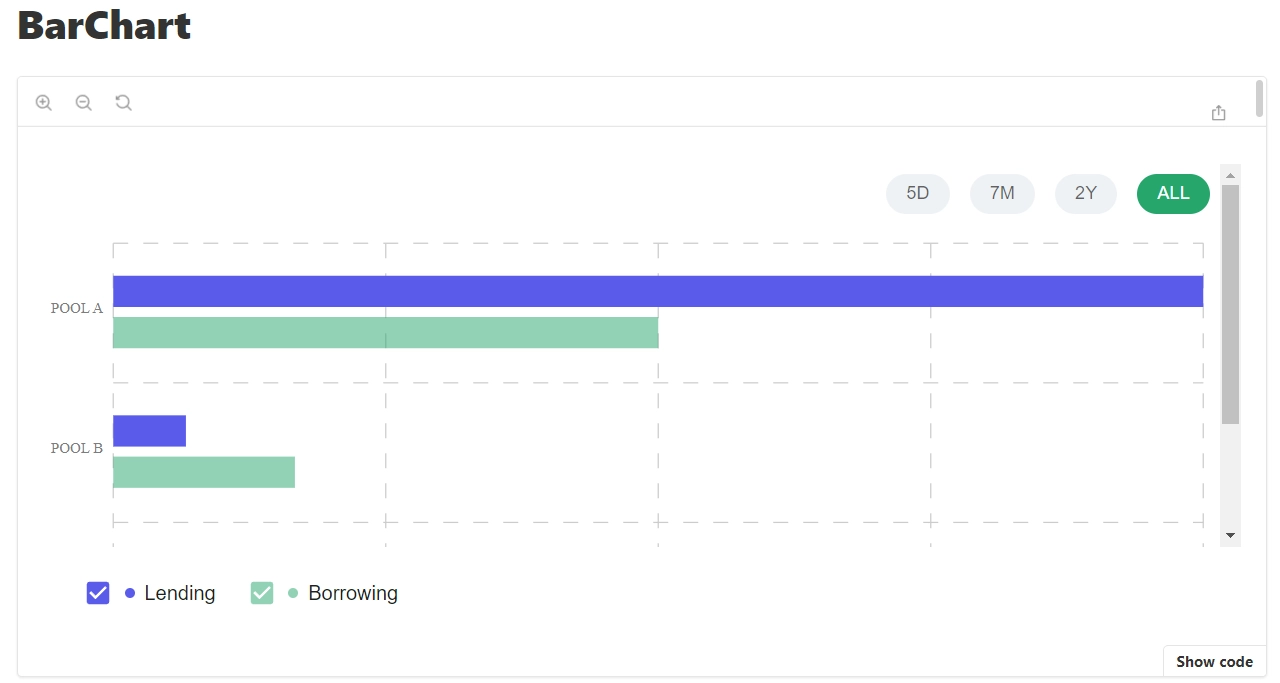
Props
Props of the Bar Chart are also available
| Name | Type | Default value | Description |
|---|---|---|---|
| formatValue | FormatValueType | - | The function to format value of tooltip of the bar chart. (Optional) |
| series | ChartSeriesType[] | - | The data series of the bar chart. (Required) |
| colors | string[] | - | The colors to represent the data of the bar chart. (Required) |
| data | string[] | - | The data of the bar chart. (Required) |
| dateFilter | string[] | - | The date filter to validate data of the bar chart. (Optional) |
| loading | boolean | - | If true, display the loading state of the bar chart. (Optional) |
| emptyTitle | string | - | The title to display if don't have data of the bar chart. (Optional) |
| emptyDescription | string | - | The description to display if don't have data of the bar chart. (Optional) |
| emptyIcon | React Element or string | - | The icon to display if don't have data of the bar chart. (Optional) |
| color | string | white | The color label of date filter of the bar chart. (Optional) |
| showXAxis | boolean | true | If true display the X Axis of the bar chart. (Optional) |
| filterBgColor | string | #26a66b | The background color label of date filter of the bar chart. (Optional) |
| currentFilter | string | - | The value of date filter of the bar chart. (Optional) |
| formatValueVertical | FormatValueType | - | The function to format value of tooltip of the bar chart. (Optional) |
| handleChangeFilter | (filter: string) => void) | - | The function to run on change of date filter of the the bar chart. (Optional) |
| displayDirection | string | horizontal | The display direction of the bars values of the bar chart with 2 values: horizontal, vertical. (Optional) |
| formatValueAxisY | FormatValueType | - | The function to format values on Y Axis of the bar chart. (Optional) |
| formatValueAxisX | FormatValueType | - | The function to format values on X Axis of the bar chart. (Optional) |
| loaderComponent | React Node | - | The loader of the bar chart. (Optional) |
| formatDate | FormatValueType | - | The function to format date of the bar chart. (Optional) |
| fontFamily | string | - | The font family of the bar chart. (Optional) |
You can interact with the component in the following link Bar Chart
Line Chart
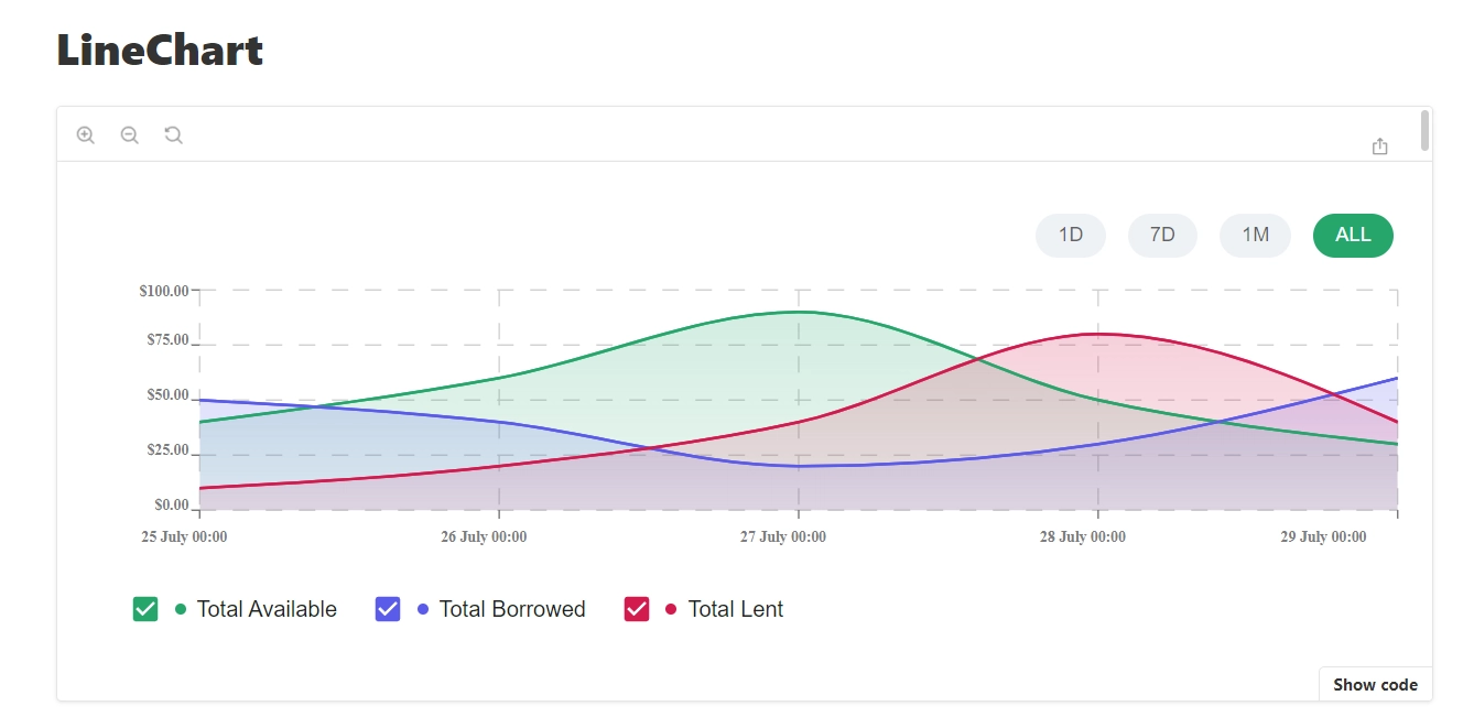
Props
Props of the Line Chart are also available
| Name | Type | Default value | Description |
|---|---|---|---|
| formatValue | FormatValueType | - | The function to format value of tooltip of the line chart. (Optional) |
| series | SeriesDataType[] | - | The data series of the line chart. (Required) |
| colors | string[] | - | The colors to represent the data of the line chart. (Required) |
| dateFilter | string[] | - | The date filter to validate data of the line chart. (Optional) |
| loading | boolean | - | If true, display the loading state of the line chart. (Optional) |
| emptyTitle | string | - | The title to display if don't have data of the line chart. (Optional) |
| emptyDescription | string | - | The description to display if don't have data of the line chart. (Optional) |
| emptyIcon | React Element or string | - | The icon to display if don't have data of the line chart. (Optional) |
| formatDate | FormatValueType | - | The function to format date of the line chart. (Optional) |
| formatValueAxisX | FormatValueType | - | The function to format values on X Axis of the line chart. (Optional) |
| formatValueAxisY | FormatValueType | - | The function to format values on Y Axis of the line chart. (Optional) |
| handleChangeFilter | (filter: string) => void) | - | The function to run on change of date filter of the the line chart. (Optional) |
| data | LineChartDataType[] or undefined | - | The data of the line chart. (Required) |
| filterBgColor | string | #26a66b | The background color label of date filter of the line chart. (Optional) |
| currentFilter | string | - | The value of date filter of the line chart. (Optional) |
| color | string | white | The color label of date filter of the line chart. (Optional) |
| loaderComponent | React Node | - | The loader of the line chart. (Optional) |
| fontFamily | string | - | The font family of the line chart. (Optional) |
You can interact with the component in the following link Line Chart
Pie Chart
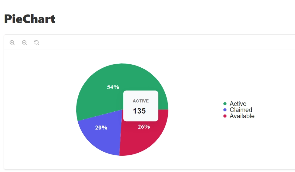
Props
Props of the Pie Chart are also available
| Name | Type | Default value | Description |
|---|---|---|---|
| data | PieDataType | - | The data of the pie chart. (Required) |
| loading | boolean | - | If true, display the loading state of the pie chart. (Optional) |
| emptyTitle | string | - | The title to display if don't have data of the pie chart. (Optional) |
| emptyDescription | string | - | The description to display if don't have data of the pie chart. (Optional) |
| emptyIcon | React Element or string | - | The icon to display if don't have data of the pie chart. (Optional) |
| fontFamily | string | - | The font family of the pie chart. (Optional) |
| loaderComponent | React Node | - | The loader of the pie chart. (Optional) |
| formatValue | FormatValueType | value => value.toLocaleString('en-US') | The function to format value of tooltip of the pie chart. (Optional) |
| formatDate | FormatValueType | - | The function to format date of the pie chart. (Optional) |
| formatValueAxisX | FormatValueType | - | The function to format values on X Axis of the pie chart. (Optional) |
| formatValueAxisY | FormatValueType | - | The function to format values on Y Axis of the pie chart. (Optional) |
You can interact with the component in the following link Pie Chart

.svg)